Every now and then the creatives at JDA go on walks during our lunch hour or head to the nearby Starbucks in the afternoon for a quick pick-me-up. Along the way we'd pass a small traffic circle surrounded by giant spherical concrete barriers. For some reason traffic circles (even the small ones) notoriously attract drivers who don't know how to navigate them, and in our case it sometimes came at the expense of one of the concrete barriers. In late October we would walk past a destroyed barrier and we would always point out how it looked like Jack in the Box because of the traffic cone the maintenance crew placed on top of it and around it for safety. Every time we passed it, we'd make some sort of reference to "Jack".
One morning as I was settling in to work I came across this news article about the infamous street artist Banksy's recent exploits in NYC:
http://www.nydailynews.com/new-york/banksy-ends-new-york-residency-article-1.1502984
Needless to say, it inspired me to give our "Jack" a face the next time we went out for one of our walks. After about 5 minutes of prep, Day 1 of the Jack facelift was done in 10 seconds. I proudly snapped a picture on my phone and shared it for friends to see on Instagram with the caption "Banksy 2.0". I thought I was done, but not quite.
Day 1 of my "street art" fell on a Friday which meant Jack would sit there over the weekend for all to see. To my surprise, when I came in on Monday (Day 4) I noticed someone had changed the mouth I placed on Jack to one of their own-- a smile. My street art just became "community street art." GAME ON.
Excited by the possibility of artistic contributions to this side project, I decided to continue making occasional changes and alterations to Jack until the necessary parties came together to have it fixed. On some of the days when I worked early hours, I'd come in and sneak on a new face before the heavier traffic started rolling in. Unfortunately the community effort in the Jack project wasn't as often as I had hoped, so for a while it was my "one-man-show" during which Jack underwent many expression changes, my favorite of which was one where he was sipping from a cup of one of his competitors. By Day 14, someone had come by and changed Jack's mouth to a slight frown and even added an unopened can of beer next to him. "It must suck to not have arms" was the caption on that day's Instagram post.
On Day 19 I rushed out to check on him after a coworker noticed that forklifts were parked nearby. As I got to the scene things seemed to be moving a little faster than I thought -- Jack was now actually on the forklift and it made me feel like I was seeing my kid off to college. That day's Instagram post disappointed a lot of people who wanted to see this saga continue, but part of me was somewhat relieved that it was soon coming to an end. By that afternoon the sphere was back where it belonged —with cone on top, but the workers removed Jack's face.
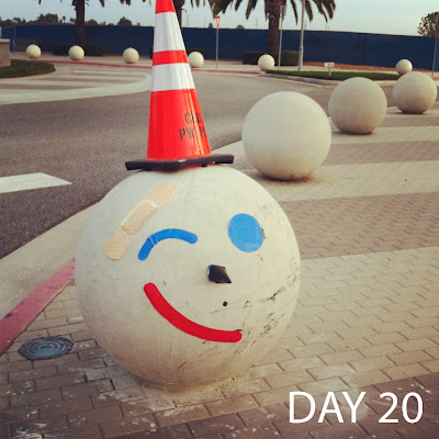
I couldn't let Jack go out like that. The next day I came in and added one last wink and a smile, with a complimentary giant bandaid as if to say "everything's gonna be alright." Again by the afternoon, his new face was gone almost as fast as it had gone up. NOW it's done.
Now 7 days removed from that 3-week adventure, I can say that it was a fun side project. A friend that works for the Jack-in-the-Box corporate office mentioned to me that the marketing team would appreciate the effort I had put out, so I made sure to retroactively hashtag and mention Jack-in-the-Box in all my previous posts. During that 3 weeks, several of us at JDA have witnessed both pedestrians and drivers stop or slow down to take a picture of the whatever face Jack had on that day. For such a silly thing it still made me quite proud that it could stir a reaction and have someone like it enough to capture it and/or share it with other people. As visual communicators, we always hope that everything we share with the world will be met with positive feedback and sometimes even a controversial reaction to maintain its position as a conversation piece, and I like to think that was the case here with Jack. To those that were disappointed by Jack's farewell wink and smile, I reminded them all that Jack was just going off to "college", and like any college student, maybe he could "visit" during holidays.
- Joel Penos


Comments