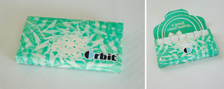
Big redesigns can come in all sizes. Who would've thought that something as simple as chewing gum could benefit from an updated look? Gone are the days where we can just pick up a simple 10 or 25 pack, grab the "tear here" tab, and rip our way to foil wrapped gum. Now you'll find an array of packaging styles, varying gum sizes/flavors, and even different ways that these packages work and fold. Before, gum used to be fully exposed once opened and prone to falling out of the packages once you're at that last handful of pieces, but gum packages nowadays close and even lock shut to conceal the gum and work as a handier carrying case than in the past.
Colors and flavors have come a long way too. You used to find a lot of primarily flat colors when picking up packs of gum. But with the advent of new flavors and flavor combinations, the color and designs of these packages are more eye catching than ever. The one of most interest is the design of 5 Gum. Never before has black been used in the package design for gum, and here it's used successfully to convey the sophistication of the brand and show that gum doesn't just have to appeal to kids. There's even a flavor where the stick of gum itself is actually black.
5Gum has also taken things step further by creating a POP that's just for their flavors. You'll still find them mixed in with all the other gum at the checkout stand, but with their dedicated POP there as well, they definitely make their presence known.
Overall, these packages prove that the "If it ain't broke don't fix it" cliche definitely doesn't have to apply to package redesign. While something as forgettable as gum doesn't require all that much attention, it's refreshing to see that these updates were made. Just goes to show that something doesn't have to be "broke" to improve it.
Joel Penos


Comments